Boosting Human Activity Recognition with Synthetic Data from Scarce Sensor Readings
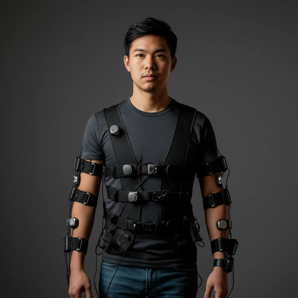
Hey there! Let’s chat about something pretty cool we’ve been working on in the world of Human Activity Recognition, or HAR for short. You know, figuring out what people are doing just by looking at data from tiny sensors they wear, like those in smartwatches or fitness trackers? It’s super useful for things like monitoring health, tracking sports performance, or even making smart homes smarter.
The Big Hurdle: Not Enough Data!
The tricky part is, to get computers to recognize these activities accurately, you need *loads* of data. You have to get people into a lab (or somewhere similar), strap sensors onto them, and record them doing all sorts of movements – walking, running, jumping, cycling, you name it. And doing that for enough people and enough activities? Well, let’s just say it’s a massive undertaking. It costs a lot of time and money, and honestly, getting participants can be a hassle.
This scarcity of data is a real bottleneck. If you don’t have enough examples of someone running or cycling, your system might struggle to identify those activities reliably, especially for people it hasn’t seen before.
Why Not Just Make Data Up?
That’s where synthetic data comes in! The idea is to train a model to *generate* realistic-looking sensor data that mimics real human movements. If we can do that, we can create as much data as we need, reducing the burden of real-world collection. Think of it as having an endless supply of practice examples for our HAR system.
Now, people have tried this before using various generative models like GANs (Generative Adversarial Networks) and VAEs (Variational Autoencoders). These models are pretty clever, but they often hit snags. Sometimes they suffer from something called ‘mode collapse,’ where they only generate a limited variety of data, missing out on the full range of human movement variations. They can also be a bit finicky to train and sometimes struggle with time series data that isn’t all the exact same length.
And here’s another thing: most previous attempts focused on generating data from just *one* sensor, maybe even just one axis of that sensor (like just the forward acceleration). Human activity is complex! It involves multiple body parts and multiple types of sensor readings (acceleration, rotation, magnetic field). We needed something that could handle more.
Our Approach: Borrowing from the Vision World
So, we decided to look at a different type of generative model that’s been making waves, especially in generating stunning images: Denoising Diffusion Probabilistic Models, or DDPMs. These models work by gradually adding noise to data and then learning how to reverse that process, effectively ‘denoising’ random noise back into realistic data. Since sensor time series data can be represented in a way that’s mathematically similar to images (like a grid of values over time), we thought, “Why not adapt a diffusion model for this?”
And that’s exactly what we did! We developed a framework we call IMUDiffusion. Our goal was to create a model that could not only generate realistic time series data from inertial measurement units (IMUs – those sensors measuring acceleration and rotation) but could also:
- Handle data from *multiple* IMUs simultaneously.
- Generate data that helps HAR systems generalize well to *unseen* people.
- Work effectively even when trained on a *tiny* amount of real data.
Pretty ambitious, right?

Getting Technical: How We Did It
We used a dataset called RealDISP, which has recordings of people doing various activities while wearing nine IMUs. For our main experiment, we focused on data from just one IMU placed on the right thigh, looking at four specific activities: Walking, Running, Jump Up, and Cycling. We chose these because they represent common movements, include a ‘minority’ class (Jump Up, which had fewer recordings), and have some activities that look quite similar (Walking and Running).
Since diffusion models often work well with grid-like data, and inspired by other work using diffusion on time series in the frequency domain, we transformed our sensor data. Instead of just using the raw time signals, we used something called the Short-Time Fourier Transform (STFT). This breaks down the signal into its frequency components over short periods, giving us a different perspective on the movement patterns. We then fed this transformed data into our adapted diffusion model.
The model architecture itself is based on standard diffusion models used for images, but we tweaked it to handle our specific data format. A key adaptation was using separate ‘schedulers’ for different sensor types (like accelerometer vs. gyroscope) because they have different noise characteristics. We also found we needed a lot more steps in the denoising process (3000 steps!) than typically used for images to get smooth, realistic motion sequences.
Training this model took some computing power – about 8 minutes per participant per activity to train the model, and then generating the synthetic data took even longer, around 3 minutes per batch of 128 sequences. For evaluating across 12 participants, this added up to a significant number of computing hours on an NVIDIA RTX 3090.
Putting the Synthetic Data to the Test
Okay, so we generated tons of synthetic data. But is it any good? We evaluated it in a couple of ways:
- Visual Analysis: We used techniques like UMAP and kMeans clustering to visualize the synthetic data alongside the real data. UMAP helps squish high-dimensional data down to 2D so you can see if similar things cluster together. kMeans clustering groups similar sequences, and we used a special averaging method called Dynamic Time Warping Barycenter Average (DBA) to find a representative ‘average’ sequence for each cluster. This let us visually compare the patterns in real vs. synthetic clusters.
- Objective Classification Improvement: This is the big one. We trained a HAR classifier (a neural network designed to identify activities) using different sets of data and saw how well it performed on *real* data from a participant it had *never* seen before. This is called Leave-One-Subject-Out Cross-Validation (LOSOCV), and it’s a much tougher test of generalizability than just splitting data randomly.
We compared three scenarios for training the classifier:
- 2 Sample Baseline: Trained only on a very small amount of real data (just 2 sequences per activity per participant). This simulates a truly scarce data scenario.
- Full-Set Baseline: Trained on *all* available real data for the training participants. This shows what’s possible with more real data.
- 2 Sample Full Synth: Trained on the same small 2 real samples *plus* all the synthetic data we generated from those 2 samples. This shows the impact of our synthetic data.
We measured performance using the macro F1-score, which is good for datasets with imbalanced classes (like our Jump Up class).

What We Found Out
The visual analysis was interesting. UMAP showed the synthetic data forming tighter clusters, while the real data was more spread out, though still within the synthetic clusters. We think this might be because the diffusion model smooths out some of the natural noise and subtle variations present in real sensor data. The kMeans clustering with DBA was really helpful though; it allowed us to pick out clusters and visually confirm that the *patterns* in the synthetic sequences, especially for the main movements, looked very similar to the real ones. Even for the sensor axes that showed less movement, the model learned to generate similar subtle patterns.
Watching the denoising process was also cool – you could see the random noise gradually resolve into recognizable movement patterns over the 3000 steps.
But the most exciting results came from the classification task! When we added our synthetic data to the tiny 2-sample real dataset, the classifier’s performance on unseen participants shot up dramatically compared to just using the 2 real samples alone. For many participants, the macro F1-score went all the way up to 1.0, meaning perfect classification! This shows that our synthetic data is high-quality and helps the model generalize incredibly well, even starting from almost nothing.
Compared to the Full-Set baseline (using *all* available real data), our 2 Sample Full Synth approach often achieved comparable or even better performance, especially for participants where the Full-Set model struggled. This is a huge deal! It suggests you might not need to collect massive amounts of real data if you can generate good synthetic data from a small starting point.
There were a few exceptions, like one participant (PID 1) where the synthetic data didn’t help and even slightly hurt performance. Our cluster analysis for this participant suggested that their real training data might have been quite different from their real test data compared to other participants, and the synthetic data generated from that unusual training data didn’t bridge the gap effectively. This highlights the challenge of inter-subject variability.
We also looked at adding more sensors (three IMUs instead of one) and more activities (eight instead of four). While adding more sensors initially helped the baseline classifier (more information!), the improvement from adding synthetic data wasn’t quite as dramatic as with the single IMU. Adding more activities generally made the problem harder for all classifiers, but again, adding synthetic data still provided a boost for most participants compared to using only the limited real data.
![]()
Wrapping It Up
So, what’s the takeaway? We successfully adapted a diffusion model, IMUDiffusion, to generate high-quality synthetic time series data from multiple IMU sensors. The cool part is, it works really well even when trained on a *very* small amount of real data (just 2 samples per activity!). This has massive implications for HAR, potentially cutting down the time and cost of data collection significantly.
We used visual methods like kMeans clustering with DBA to get a feel for the data’s quality, but the objective proof came from the classifier improvement. Adding our synthetic sequences boosted performance on unseen subjects, often matching or exceeding results achieved with much larger real datasets.
Of course, there’s always room to grow. Visual analysis is subjective, and while clustering helps, we need more objective ways to measure synthetic data quality directly. Computation time is still a factor, though we think future work could speed this up, maybe by integrating quality metrics into the training process itself. We’re also curious to see how well this approach works for other types of time series data, especially in situations with very few examples of a particular event (minority classes).
Overall, we’re pretty excited about IMUDiffusion. It opens up new possibilities for tackling the data scarcity problem in HAR and other domains relying on time series sensor data. It feels like we’ve taken a solid step forward in making activity recognition more accessible and robust!
Source: Springer


