Your Commute, Your Carbon: What Jinan’s Big Data Says About City Design
Hey There, Let’s Talk Commutes!
Hey there! Let’s chat about something that affects pretty much all of us living in cities: that daily grind, the commute. You know, getting from point A to point B. It might seem simple, but how our cities are built – the roads, the buildings, where everything is located – actually has a *huge* impact on how we travel and, importantly, the carbon emissions we generate just by getting around. With cities growing super fast, especially in places like China, figuring out how to make transportation cleaner is a massive challenge. It’s like trying to solve a giant, moving puzzle!
I’ve been diving into some fascinating research that looks at exactly this – how the built environment influences commuting carbon emissions. This particular study zoomed in on the main urban area of Jinan, a key city in China, and they used something pretty cool to do it: big data. We’re talking travel trajectories, land use maps, and even street view images. It’s like getting a super detailed look at how people move and what their surroundings are like.
Why This Is a Big Deal
So, why focus on transportation emissions? Well, in China, they’re aiming for peak carbon emissions by 2030 and carbon neutrality by 2060. That’s a big goal! But transport is lagging behind other sectors; it’s the third-largest source of greenhouse gases nationally, making up about 10% of the total, and it’s growing fast. High-frequency commuting is a major culprit, adding to congestion and emissions. So, tackling the commute is a critical step for low-carbon cities.
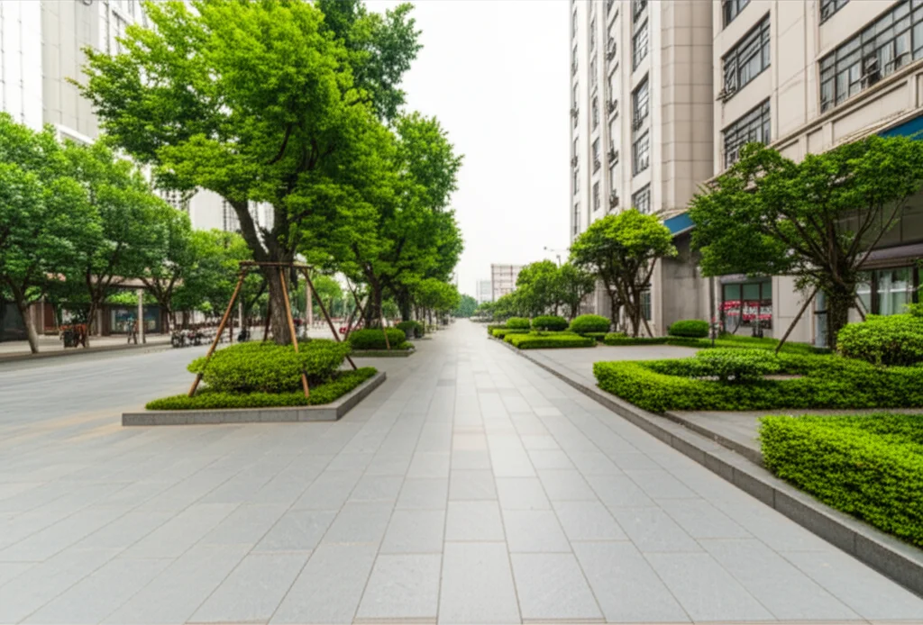
The built environment isn’t just scenery; it’s a key player here. Its layout – where homes are, where jobs are, the roads connecting them, even how dense things are – really shapes our travel choices: how far we go, how often, and what mode we use. Early ideas, like New Urbanism, already hinted that things like density, mixed land use, and walkability could reduce our reliance on cars. But traditional studies often used older data or focused only on big-picture stuff. This is where big data comes in, offering a much sharper picture.
Using things like navigation data can show us exactly where people are starting and ending their trips, and even the routes they prefer. Street view images, analyzed with fancy AI (deep learning!), can tell us about the micro-level stuff – what the street *looks* and *feels* like. But putting all this different data together isn’t always easy. Plus, many older models assumed the impact of the built environment was the same everywhere, which, let’s be honest, doesn’t really make sense in a diverse city.
Most studies have also focused on mega-cities. But what about medium-sized cities like Jinan? They’re in a different phase, shifting from a single center to more spread-out clusters, with homes and jobs often getting separated. They need tailored strategies, not just a copy-paste from Beijing or Shanghai. So, this study aimed to fill those gaps, using multi-source data, a wider range of built environment factors (including those street-level perceptions!), and more advanced spatial models to really understand what’s going on in Jinan.
Our Toolkit: Smart Methods and Big Data
To figure all this out, the researchers pulled together a bunch of data:
- Commuting Trajectories: Using data from Baidu Maps (like a Chinese Google Maps), they tracked millions of commutes to see where people went, how long it took, and what mode they used (driving, public transport, green modes like walking/biking).
- Urban Land Use: Data showing where residential, commercial, industrial, public service, and transportation areas are.
- Street View Images: They grabbed tons of images along Jinan’s roads to analyze what the streets actually look like.
- Other Data: Population, points of interest (POIs), road networks, building shapes, even housing prices!
They used some clever methods to crunch this data:
- Spatial Autocorrelation: To see if areas with high emissions are clustered together.
- Linear Regression: To identify which built environment factors seem linked to emissions.
- Geographically Weighted Regression (GWR): This is key! It lets us see if the *strength* of the relationship between a factor (like road density) and emissions changes depending on where you are in the city. It reveals that spatial heterogeneity I mentioned.
- Geographic Detectors: To see how different factors *interact* with each other to influence emissions.
- XGBoost: A machine learning method to rank which factors are the *most* important overall.
Jinan’s Commuting Snapshot
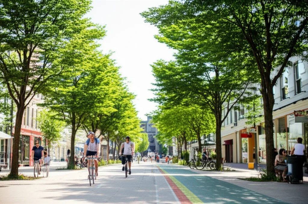
So, what did they find in Jinan? First off, the average commute distance is about 6 km. And guess what the main way people get around is? Private vehicles, making up about 40% of commutes. Buses are around 22%, and green commuting (walking/biking) is about 38%. Interestingly, the proportion of car commuting is lower in the city center and higher out in the suburbs. This makes sense, right? More options in the center, less so further out.
When we look at where the emissions are happening, it’s a bit of a mixed bag. Residential areas with high *total* emissions are often near the Third Ring Road – places with lots of people. But areas with high *per capita* emissions (emissions per person) are more in the newer, outer areas. Workplace emissions are higher in employment-heavy streets, especially in eastern and northern new town areas.
Using spatial analysis, they confirmed this. The central urban area often shows a “low-low” cluster for residential emissions (low emissions, surrounded by low emissions). But areas between the center and suburbs show “high-high” clusters – places with high emissions surrounded by high emissions. This highlights a “commuting hot zone” between the second and third rings, where lots of people live and commute longer distances to jobs in the center or suburbs. The center and far suburbs are “cold zones” with shorter commutes, either due to proximity or specialized local jobs (like agriculture).
The Built Environment’s Fingerprint
The study dug into how specific built environment factors influence these emissions. Using regression, they found that for residential emissions, things like:
- Road network density
- Number of subway stations
- Proportion of land for transportation facilities
- Number of commercial and residential units
…were all linked to *higher* emissions. More roads, more transit options, more mixed-use buildings – sounds counter-intuitive, maybe? But it’s complex. More roads can mean more driving options. More transit *should* reduce emissions, but maybe the *type* or *coverage* matters. More mixed units can mean more trips overall, even if some are short.
On the flip side, more industrial land and tourist attractions were linked to *lower* residential emissions. Industrial areas often mean jobs are closer to homes, reducing commute distance. Tourist areas can boost public transport or non-motorized options.
For workplace emissions, factors like the number of companies, road network length, housing prices, residential land area, subway stations, and public service facilities were linked to higher total emissions. Basically, places with more activity and infrastructure tend to have more commuting activity ending there, thus higher total emissions.
Street Smarts: How Perception Plays a Role
This is where it gets really interesting! The study looked at how street-level perceptions, extracted from those street view images, influence *per capita* emissions. They found that:
- Greenness: Streets with more visible greenery were linked to *lower* per capita emissions. Why? Nicer environment for walking or biking, better access to public transport.
- Safety: Streets perceived as safer (good lighting, separation from cars) also correlated with *lower* per capita emissions. Feeling safe encourages walking and biking.
- Openness vs. Depression: Wide, open streets (maybe with green belts) can make walking/biking more appealing. Confined, “depressed” streets (narrow, lots of parking blocking sidewalks) can feel stressful and push people towards driving.
It turns out, how a street *feels* can really change your mind about how you want to travel!
It’s Not Uniform: Spatial Differences
The GWR analysis confirmed that the impact of these factors isn’t the same across Jinan. For instance, the positive impact of transportation infrastructure land on residential emissions was stronger in the north than the south. Greenness had a layered effect: high greenness + low emissions in the core, medium greenness + medium emissions in the suburbs, and low greenness + high emissions in the outer suburbs. This suggests different strategies are needed for different areas.
For workplaces, areas with high-density mixed-use development (like in the core) had lower per capita emissions because people could commute shorter distances. But areas with a single function (like “dormitory towns”) often had higher emissions, partly because the lack of mixed uses pushed people to drive.
Who’s the Boss? Ranking the Factors
Using XGBoost, they ranked the factors by importance. For *total* emissions, the big drivers were the number of commercial and residential units (at home locations) and the concentration of companies (at work locations). This makes sense – where people live and work in large numbers dictates the scale of commuting.
But for *per capita* emissions (which reflect individual choices), street-level perceptions like greenness and safety were surprisingly important, alongside road network density and the number of companies. This tells me that while the big stuff like where jobs are located sets the stage, the smaller, more human-scale elements of the built environment really influence *how* individuals choose to travel.
Working Together: Factor Interactions
The geographic detectors showed how factors team up. For total emissions, the interaction between commercial/residential land and transportation land was very influential – they need each other! For per capita emissions, the interaction between road network density and tourist attractions was strong. This suggests that having a dense road network near tourist spots can actually *help* reduce per capita emissions, perhaps by making public transport or walking/biking to attractions easier, or by encouraging mixed-use development around them.

So, What Do We Do? Recommendations
Okay, so what’s the takeaway for city folks and planners? This research gives us some solid, data-driven ideas:
- Differentiated Planning: Don’t use a one-size-fits-all approach. Recognize the spatial differences (like the north-south gradient in Jinan) and tailor policies.
- TOD + Work-Residence Balance: Promote Transit-Oriented Development (building around transit hubs) and plan cities so homes and jobs aren’t too far apart. This reduces the need for long car commutes.
- Green Space Optimization: Greenery isn’t just pretty; it’s functional for low-carbon transport! In the city core, focus on creating small, accessible green spaces (like a “500-meter green view” project). In the outer suburbs, link up fragmented green spaces with ecological corridors to encourage walking and biking.
- Monitor Perception: Use data (like mobile signals and street view) to track how people experience the urban environment in real-time. This can help identify areas where improving safety or greenness could nudge people towards low-carbon travel. Integrating this with digital twin technology could allow simulating the impact of design changes.
The study also highlighted that in dense core areas, boosting tourism and mixed-use development around attractions might be *more* effective at reducing emissions than just building more roads. It’s about activating the existing potential through “spatial acupuncture” – targeted interventions – rather than just expanding infrastructure endlessly. This is a cool idea for historical cities!
A Peek Ahead: Limitations and Future Work
Now, no study is perfect, and this one has a few limitations, which the researchers are upfront about. The commuting modes were simplified (driving, public transport, cycling), not as detailed as a survey might be. Also, using streets as the analysis unit can sometimes lead to the Modifiable Areal Unit Problem (MAUP), where the results might change if you used different boundaries. The next step, they suggest, is to use a finer grid system and analyze data at multiple scales (city, district, street, neighborhood, grid) to get an even more accurate picture.
Wrapping Up
So, there you have it. This deep dive into Jinan using big data really shows us that the design of our cities is fundamentally linked to our daily travel choices and, consequently, our carbon footprint. It’s not just about building more roads or adding more buses; it’s about creating environments that make low-carbon travel appealing, safe, and convenient. By understanding these complex relationships, especially the spatial differences and the power of even small things like street greenness, we can make smarter planning decisions for a more sustainable future. It’s a big challenge, but with the right data and approach, I think we can crack this commute code!
Source: Springer