Japan’s Economic Pulse: Unlocking Monthly GDP for Every Prefecture!
Hey there! Ever wondered what’s *really* going on with the economy in specific parts of Japan, not just the big national picture? You know, how is Hokkaido doing this month compared to Okinawa? For folks trying to make smart policy decisions, especially when something big happens like a pandemic or, heaven forbid, a natural disaster, having up-to-the-minute economic info for different regions is absolutely crucial. But here’s the rub: the official stats we’ve had for regional economies in Japan, the Prefectural Economic Accounts, are only released once a year, and they come with a pretty hefty two-year delay. That’s like trying to drive by looking in the rearview mirror!
Sure, we get some monthly data like industrial production or labor surveys, which are helpful, but they only give us a piece of the puzzle. To get a real feel for what’s happening on the ground, you often have to stitch together these limited numbers with other bits of info. That’s where we come in! We’ve been working on something pretty cool – a brand new way to measure monthly GDP for *each* of Japan’s prefectures. Our goal? To give everyone better, higher-frequency data to understand regional economic life.
How We Built This Thing
So, how did we pull this off? It’s a two-step dance, really. Think of it like building a house – you need a solid foundation from different angles.
First, we looked at GDP from two perspectives:
- Production-side GDP: This is about what industries are producing. We used official stats like the Indices of Industrial Production (IIP) for manufacturing, construction output data, and the Indices of Tertiary Industry Activity (ITA) for services. We weighted these based on how much each sector contributes to a prefecture’s economy.
- Expenditure-side GDP: This is about what people and businesses are spending. We used the Regional Domestic Expenditure Index (RDEI), which covers things like household consumption, private investment (both residential and corporate), and public investment.
Now, in a perfect world, these two numbers should match up perfectly for each prefecture every month. But because data collection isn’t always perfect, and some bits of the economy are harder to track monthly (like agriculture or exports/imports between prefectures), they usually don’t line up exactly. So, for our second step, we took a simple average of the production-side and expenditure-side figures for each prefecture. We call this the “unadjusted GDP.”
The final touch? We adjusted these unadjusted numbers so that when you add up all the prefecture-level GDPs, the total matches the official national quarterly GDP. It’s like making sure all the puzzle pieces fit together to form the national picture. This adjustment is key to keeping our monthly regional data consistent with the big-picture national data everyone relies on.
Production vs. Expenditure: A Tale of Two Sides
Let’s dive a tiny bit deeper into those two sides. For the production side, we grabbed monthly data for manufacturing (IIP), construction (using real-valued, seasonally adjusted output data), and services (ITA). Since prefecture-level ITA isn’t widely available, we cleverly built our own by weighting national ITA data based on the specific mix of industries in each prefecture, using data from economic surveys or input-output tables. We then combined these three sector indices using weights based on each sector’s contribution to the prefecture’s value-added.
Looking at examples like Tokyo and Aichi, you see how this works. Tokyo’s economy is heavily service-based (over 80% weight!), so its production-side GDP pretty much follows the service index (ITA). When the State of Emergency hit in April 2020, both manufacturing and services dipped in Tokyo, but construction held relatively steady. Aichi, on the other hand, has a bigger manufacturing slice (around 40%), so its GDP is influenced more by both manufacturing (IIP) and services (ITA), often falling somewhere in between their movements. During the SOEs, Aichi’s manufacturing took a bigger hit than its services.
On the expenditure side, we used the Cabinet Office’s RDEI, which gives us monthly data for consumption, private residential investment, private corporate investment, and public investment for each prefecture. We weighted these based on their actual values from the annual Prefectural Economic Accounts. Again, looking at Tokyo and Aichi, private consumption is a huge driver of fluctuations in both. But in Aichi, private investment also plays a significant role in explaining the RDEI movements, which makes sense given its manufacturing base, unlike Tokyo where it’s less prominent. It’s fascinating how these two perspectives, production and expenditure, tell slightly different but complementary stories about a prefecture’s economy.
Combining these two sides gives us a more robust picture than relying on just one, as some previous studies did. As some smart folks have pointed out, averaging different measures often gets you closer to the true value. Pretty neat, right?
Peeking into the Future (or Just the Recent Past): Backcasting!
Okay, so we can calculate monthly GDP with this method, but there’s a catch. The official data we use to build it – IIP, construction stats, RDEI, and the national quarterly GDP – aren’t available immediately. There’s a lag, typically 3 to 5 months, before we can compute the *actual* monthly GDP for the most recent periods. This is where our “backcasting” magic comes in.
Backcasting is basically our way of estimating GDP for those most recent months where the official data isn’t out yet. We do this by looking at the historical relationship between our calculated GDP and a bunch of “alternative data” – stuff that *is* available more quickly. This alternative data includes things you might not typically think of as core economic stats, like human mobility data, web search results, but also faster-releasing public stats like household expenditure surveys or commercial statistics.
We use a statistical model that learns from the past relationship between GDP and these alternative data sources. It’s like teaching the model, “Hey, when mobility data does *this*, GDP usually does *that*.” Then, for the recent months where we have the alternative data but not the official GDP inputs, the model makes an educated guess about what the GDP is likely doing. We actually get multiple estimates, one from each alternative data source, and then we average them. The cool part? We give more weight to the data sources that have historically been better predictors of GDP, based on how accurate their past estimates were.
The accuracy of this backcasting improves as more alternative data becomes available over time. For instance, our production-side GDP calculation (which uses faster-releasing data than the expenditure side) becomes available with a two-month lag. When this production-side data becomes available, it significantly boosts the accuracy of our backcasts for the months just before it. It’s a bit like getting more clues in a detective story – the more clues you have, the better your guess about what happened.

We’ve tested this backcasting process, and it works pretty well! We can see that the estimates get closer to the actual GDP values as more alternative data rolls in. This means even for the very recent past, we can provide a reasonably good estimate of what’s happening economically in each prefecture, long before the official annual data arrives.
Putting the Data to Work: Real-World Insights
So, now that we have this shiny new monthly prefecture-level GDP data, what can we actually *do* with it? Turns out, quite a lot! We ran a few quick analyses just to show off its potential.
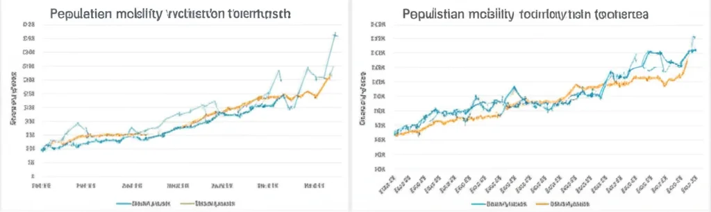
First, we looked at the relationship between our monthly GDP and population mobility. During the COVID-19 pandemic, this was super relevant because restrictions affected both. We found a positive correlation in all prefectures – when people moved less, the economy tended to slow down. But the strength of this link varied *a lot*! Tokyo and Hyogo showed a strong connection, while Hokkaido’s was much weaker. This highlights how different regions reacted differently to the pandemic’s impact on movement.
Next, we checked the link between weekly GDP (we interpolated our monthly data for this) and changes in new COVID-19 cases. This is that tricky trade-off between keeping the economy going and controlling the virus. In most prefectures (29 out of 47), we saw a positive correlation between weekly GDP and the *growth rate* of new cases. This suggests that in many places, more economic activity unfortunately went hand-in-hand with the virus spreading faster. Again, the correlation varied, with Tokushima showing the strongest positive link and Kagoshima the weakest (actually slightly negative).
Finally, we dipped into a more classic economic relationship: GDP and inflation, kind of like the Phillips curve idea. Using data from April 2015 to March 2022, we looked at monthly GDP and the year-on-year change in consumer prices (excluding fresh food) for each prefecture. In the vast majority of prefectures (43 out of 47), we found a positive correlation – when GDP was higher, inflation tended to be higher too. Yamaguchi had a particularly strong link, while Fukushima showed a negative one. We also used a statistical model to see if this relationship changed during the COVID-19 period. The results suggest that while the positive link exists overall, it actually weakened during the pandemic.
These examples are just the tip of the iceberg. Our monthly prefecture-level GDP data can be used for all sorts of regional economic analyses, helping policymakers and researchers understand the unique dynamics of each part of Japan.
What’s Next? Always Room to Grow
We’re really excited about this new measure, but we know there’s always room to make things even better. We see a couple of main avenues for future work.
First, we can potentially improve the GDP measure itself. If we could get our hands on even more specific, high-frequency alternative data for particular sectors within prefectures – like detailed retail sales data or electricity usage in commercial areas – we could incorporate that into our calculation. This would help our numbers reflect the ground truth even more accurately.
Second, the backcasting methodology could be refined. While our current approach works well, exploring other advanced statistical techniques like mixed-data sampling (MIDAS), dynamic factor models (DFM), or even machine learning algorithms might lead to even more accurate estimates for those recent months. We’re leaving these exciting possibilities for future research!
In a nutshell, we’ve developed a valuable new tool for understanding Japan’s diverse regional economies on a much more timely basis than ever before. We hope researchers and policymakers will find it incredibly useful for tackling important questions and making informed decisions.
Source: Springer


